 Right. So I went to some castle ruins in Baconsthorpe. It's a nice little quiet village on the way to Cromer. Down a (long) quiet little (very narrow) road, are some ruins of an old fortified manor house. It's erroneously called Baconsthorpe Castle. But I guess that has a ring to it.
Anyhow.
There isn't really much to see there, but it's a pretty nice place to sit down and pontificate to the nothingness.

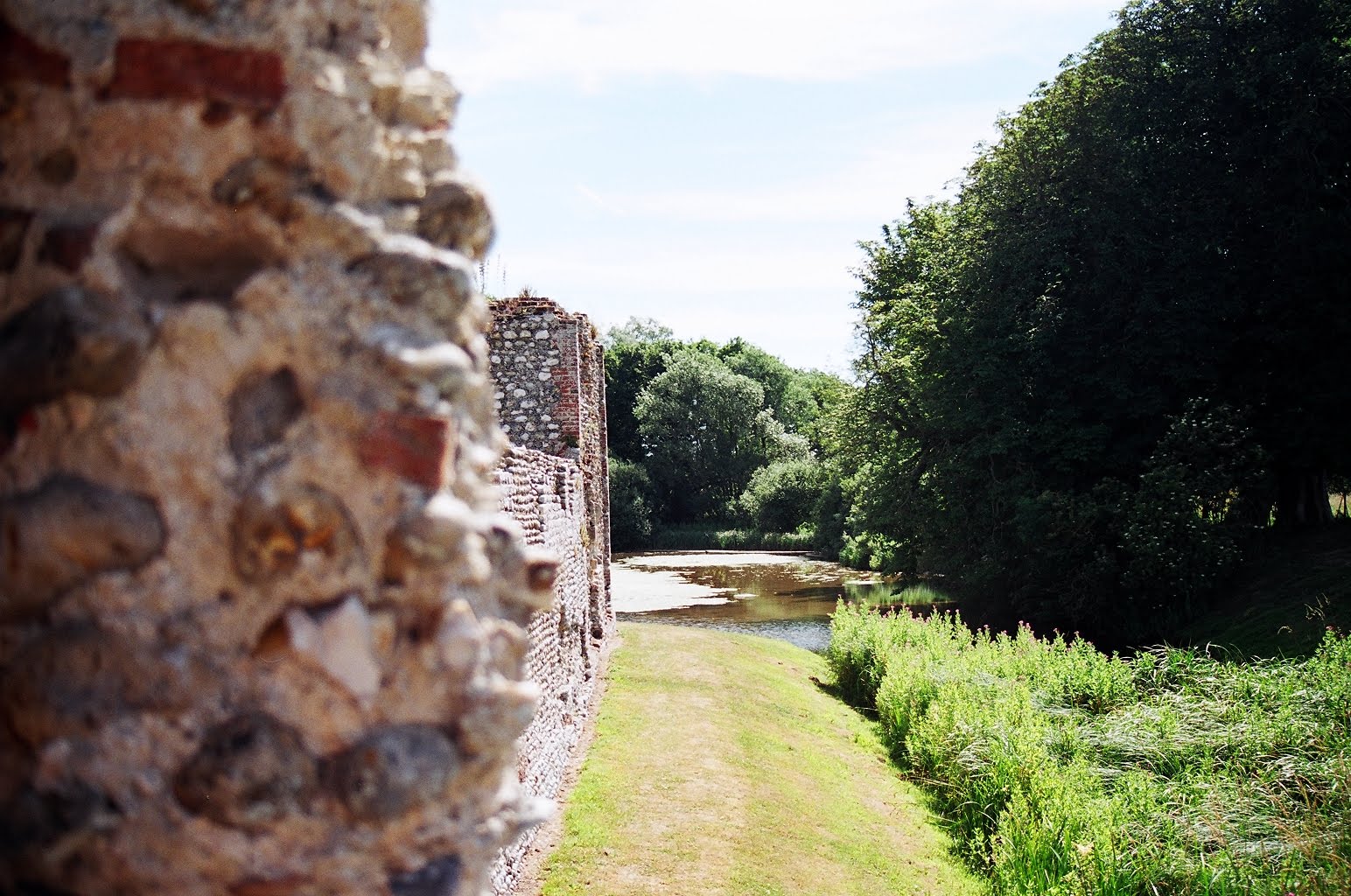
I'm not so confident with colour photos, so I was trying some things with depth. The one above, I crawled half way down into the moat and shot upwards to get the grass in the foreground. The one below is kind of interesting with the varying degrees of light.
I'm glad I went out the day I did. The clear sky made the colour shots come out pretty nicely. I only took about 8 in colour though.

Using the film that I am, I was told I would get a quite a stark difference between the lights and darks. Even on a clear day the black and white pictures came out rather well.

Similar to the photo above. This one below is much better I think.


Obviously I can't hold a camera straight...

I really like the following ones.

I wasn't entirely sure how these would come out. I emphasise a substantial amount of trial and errors made, ended with these photos.

This one's nice. Shame about the fence though.

No comments:
Post a Comment